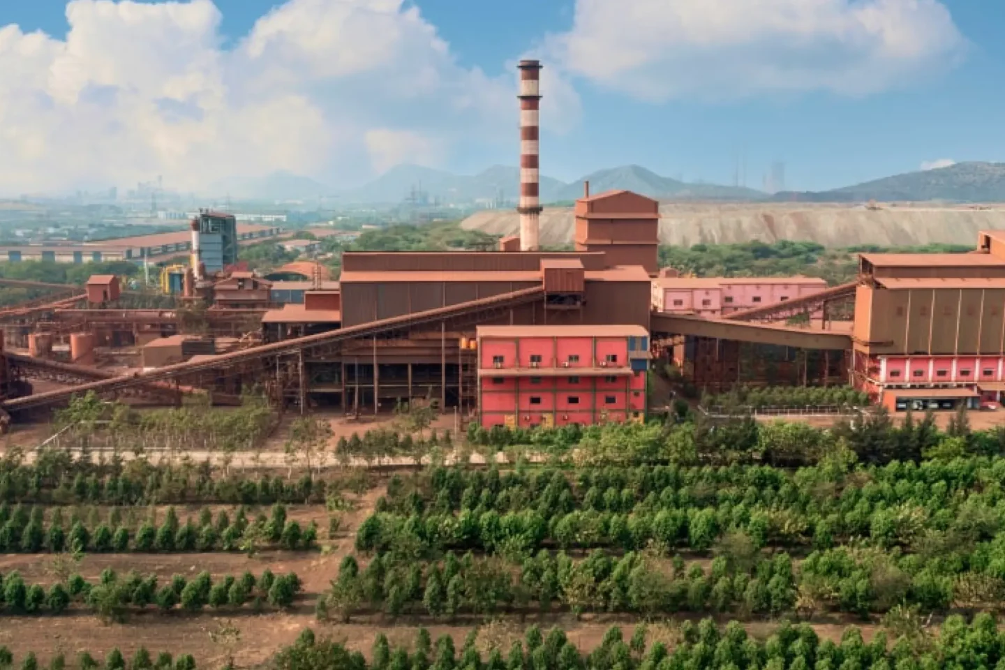
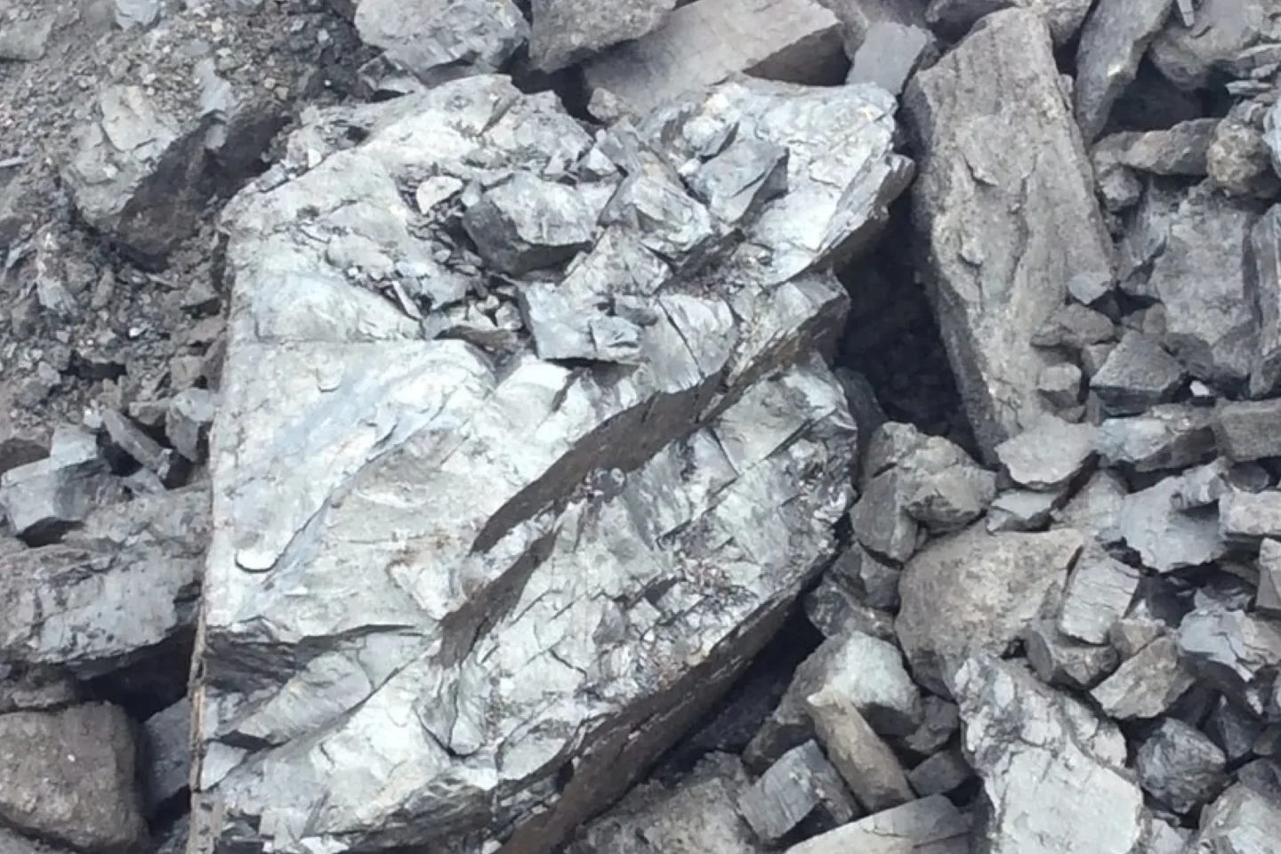
In a vertically integrated steel and commodities manufacturing operation managing millions of tonnes of inventory, production schedules, and trading data across multiple facilities in India and beyond, the ability to visualize, filter, and interact with complex datasets in real time is mission-critical. Minera Group, handling raw materials (iron ore pellets, coal, bauxite), production metrics, and finished steel products, required enterprise-grade data table interfaces that balanced sophisticated functionality with intuitive usability—all optimized for field operations, office dashboards, and mobile access.

Project Overview
- Salesforce Lightning Web Components (LWC)
- HTML5
- CSS3
- SLDS (Salesforce Lightning Design System)
- Responsive Design
- LWC Developer & Architect
- UI Component Designer
- Mobile-First Optimization Specialist
- QA & Accessibility Lead
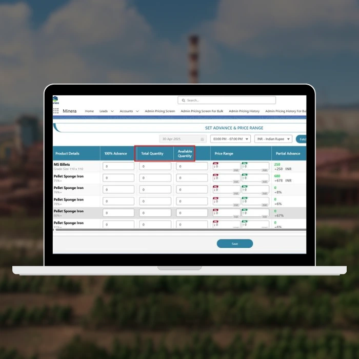
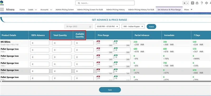
- Custom Table Layout Design (Headers, Rows, Cells—all bespoke styling)
- Dynamic Input Fields with Conditional Rendering
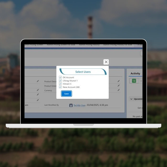
- Custom Button Components & Controls
- Table Height Optimization & Performance Tuning
- Mobile Responsiveness with Horizontal Scroll Implementation
- Label & Conditional Input Logic
The Challenge
Minera’s data-heavy operations required displaying massive datasets—production orders, inventory allocations, shipment tracking, quality metrics—in interfaces that users on the shop floor could navigate as easily as office-based analysts. The standard SLDS data table component, while robust, didn’t meet Minera’s specific needs: custom row styling for priority-flagging, conditional inline editing for production adjustments, and fluid mobile responsiveness for warehouse teams accessing dashboards on tablets.
The core complexity was building a fully custom table system from scratch—headers, row structures, cells, and input fields—without relying on pre-built Salesforce components, ensuring pixel-perfect design consistency and meeting exacting performance requirements for datasets with hundreds to thousands of rows.
Research & Design Process
I conducted workflow analysis with Minera’s operations and warehouse teams:
- Shop Floor Operators: Needed quick visibility into production batch data and real-time status updates
- Office Analysts: Required sorting, filtering, and export capabilities for reporting
- Mobile Users: Warehouse staff accessing inventory data on tablets during shift work
Key findings shaped the design:
Custom button styling boosted action discoverability compared to generic SLDS buttons
80% of users accessed tables on desktop, but 20% on mobile required seamless experience
Horizontal scroll was preferable to column hiding for warehouse staff (muscle memory from legacy systems)
Height-constrained tables improved cognitive load—users could see 10–15 rows at a time without fatigue
Design & Development Iterations
Phase 1: Component Architecture
- Mapped table requirements into reusable LWC components
- Designed data model for columns, rows, and cell configurations
- Planned responsive breakpoints and scroll strategies
Phase 2: Custom Styling & Layout
- Built base table structure with flexbox for flexible column widths
- Implemented fixed header with scrollable body
- Crafted custom button and input field styles
Phase 3: Conditional & Dynamic Logic
- Developed cell-level conditional rendering
- Integrated Apex controllers for data fetching and row-level actions
- Added real-time validation and error handling
Phase 4: Mobile Responsiveness
- Tested on iOS Safari, Chrome for Android, desktop browsers
- Optimized horizontal scroll UX with touch-friendly interactions
- Adjusted font sizes and spacing for legibility on smaller screens
Phase 5: QA & Accessibility
- Keyboard navigation support (Tab through cells, Enter for actions)
- ARIA labels for screen readers
- Performance testing with 500–1000 row datasets
- Cross-browser compatibility (Chrome, Firefox, Safari, Edge)
Key Outcomes & Impact
- Performance: Rendered 1000-row tables in < 2 seconds; smooth scrolling without jank
- User Adoption: 95% task completion rate for inline edits; users praised intuitive layout
- Mobile Efficiency: Warehouse teams completed inventory checks 30% faster with optimized mobile view
- Design Fidelity: Pixel-perfect custom components matched Minera’s internal design system and brand guidelines
- Maintainability: Modular LWC architecture allowed rapid iterations and feature additions
Technical Depth: CSS & Responsive Design
The table employed advanced CSS techniques:
- CSS Grid & Flexbox for responsive column management
- CSS Variables for theming and dynamic styling
- Media Queries for breakpoint-specific layouts
- CSS Transitions for smooth hover and state changes
- Calc() functions for dynamic sizing based on viewport
Retrospective
This project reinforced the importance of designing from first principles when off-the-shelf components don’t fit the bill. By building custom table infrastructure, I gained deep insight into responsive web design, performance optimization, and the nuances of mobile-first UX for data-heavy applications.
Key learnings:
- Custom components require rigorous testing: Edge cases with different data types, screen sizes, and user behaviors emerged through iterative QA
- Mobile-first is critical: Designing for mobile constraints first, then scaling up to desktop, resulted in cleaner, more efficient code
- Conditional rendering saves real estate: Showing only relevant fields per row reduced cognitive load significantly
- Fixed heights improve scannability: Users could quickly parse datasets when table height was bounded, preventing endless scrolling fatigue